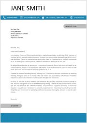
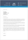
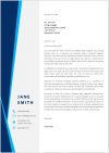
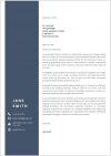
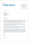
The cover letter is one of the first documents that make an impression on your future employer. So, make a good first impression with a professional, modern design. Watch the video to learn how to create a cover letter template in Word.
Note: Under the video, you will be able to download the cover letter template.
Hey there, my name is Leon and in this video, I will show you how to create a modern professional cover letter template in Word. Before we start, please subscribe to support the channel.
Contact Info Bar
At first we have to set the correct page format. So, we go the “Layout” tab, click on “Size” and select the size that we need. Since in my country the A4 format is standard, I will choose A4 here. Then we will insert a horizontal bar which will contain our contact information. So, we open the “Insert” tab, then the “Shapes” dropdown and select the rectangular shape. Now we just roughly drag the rectangle and then we set the exact size for the rectangle. I am going to set 1cm for the height and 21cm for the width. Note, that I am choosing a width that is the exact size of my page. So, if you chose the letter format for example, you should set a width of 21.59cm. Then we center this bar by clicking on “Align” and afterwards on “Align Middle”. And now we change the color of the bar. Since I don’t want to use any of the predefined colors, I click on “More Fill Colors” and set a custom color here.
Icon With Description
Let’s now insert our first contact icon. We again go to “Insert” and select “Icons”. Then we type “Phone” in the search bar and select the corresponding icon. For this icon, we have to change the layout options, so that we can freely move it on the page. Here we will choose the layout option “In Front of Text”, as this is the most flexible option. Since the icon is a bit too big for the blue bar, we set the height to 0.7cm and the width will automatically adapt to that size. Now we will insert a text box for the phone number. So, we go to “Insert”, click on “Text Box” and select the first text box. From this box we remove the background color and also the outline. And then we can already enter our phone number. As you can see, the text is not perfectly vertically centered inside the text box. This is because Word automatically added space after the text. To remove that space, we go to the “Home” tab, open the line spacing options and click on “Remove Space After Paragraph”. Now we can already start to position the icon and the text box roughly relative to each other. Then we select both objects. Note that you need to hold down the “CTRL” key, to select multiple objects at once. And when both objects are selected, we can align them perfectly by going to the “Format” tab, then hitting “Align” and then “Align Middle”. And to be able to move the 2 objects around as one item, we group them together. Now you can see, that the outline is a bit long. This is, because we didn’t adapt the size of the text box. So, we will simply do that now.
Duplicate Icon
Then let’s duplicate the first contact information. For that we click in it and we will see 2 outlines. Since we want to duplicate the whole package, we have to select the outer most outline. And to now duplicate it, we hold down the “CTRL” key and drag the outline downwards. Since the duplicated item will contain our email, we have to change the icon by right-clicking on it, then selecting “Change Graphic” and afterwards “From Icons”. Now we type in “mail” and insert the mail icon. Of course, we also have to change the phone number to an email address and again adapt the size of the text box. And in my case it happened, that Word automatically capitalized the first letter. Since that does not look good, I move the cursor to that letter, then I move it downwards and open the AutoCorrect options. Here I can then undo the capitalization. Now we repeat the process of duplicating the contact item for the home address and the website.
Position Icons
The next step is to position the contact items roughly on the blue bar. Then we change the fill color of the icons to a white color – and we do the same for the text color. And now we will align all contact items relative to each other. For that, we first have to select all of them. And when we have to select multiple objects it makes sense, to activate the corresponding selection tool. So, we click on “Select” and then on “Select Objects”. And now we can simply drag a rectangle over all our objects that we want to select. Afterwards we go to the second “Format” tab and align all objects vertically, as we already did it before. To deactivate the object selection tool, we press the “ESC” key and we are back in the normal mode again. But since we will now group all the contact items and also the blue bar, I will activate the object selection mode again, – select all contact items – and manually add the blue bar, by holding down the “CTRL” key and clicking on its outline. Note, that the blue bar didn’t get selected with the other objects, since the selection rectangle didn’t fully cover it. So, let’s group all the items and the contact information bar is done.
Name Text-Box
Now we will insert a text box for the name. Again, we remove the fill color and the outline – and then we write our name in it. I’m going to change the size to 48 and adapt the width of the text box. And again, I’m going to remove the space after the text. When we now want to position the text box at the top, we will notice that it can’t be moved up there. This is, because we have to change the layout options of the text box first. Let’s choose “In Front of Text” again, as it is the most flexible one. And now we can move it up and reposition everything a bit.
Date Bar
Then we will insert a bar for the date. And for that we select a shape with 2 rounded corners. To make the upper end perfectly round, we drag the orange point to the middle. Then we set a width of 1.1 cm and a height of 5.7cm. Afterwards, we change the background color to a grey color and remove the outline color. Now we rotate the bar by 90° – And then we can already insert the text box for the date. We again remove the fill color and the outline – then we write in the date and remove the space at the bottom of the text box. After that, we resize the text box a bit and position it roughly on the grey bar. Then, we again align both objects relative to each other – group them – and position the group at the right side of the page.
Content Area
Since the content text of the cover letter will start approximately 7 cm under the top border of the page, we have to change the top page margin. But before we do that, we first need to set a fixed positon for all the objects that we created. So, we click on the object, and in the layout options we select “Fix position on page”. If the button for the layout options doesn’t appear, we can also access these options in the “Format” tab under “”Wrap Text”. And now we can change the margin without moving all the objects that we created. So, we go to “Layout”, click on “Margins” and then on “Custom Margins”. Here we set a top margin of 7cm. Then we write down the contact information of the company we are applying to. And since there is a lot of space between the lines, we select all but the last line and again remove the space after the paragraph. Now I am going to paste a placeholder text, which has a grey color and a also a full justification alignment.
Signature Bar
Afterwards, we duplicate the grey bar with its text – and we rotate it by 180°. Now we have to rotate the text box back – and then we can already write our name in there. Note, that we should position the text box in a way, that it approximately aligns with the margin of the content text.
And to make the design a bit more vivid, we insert a rectangular shape at the bottom – make it 21cm wide and 2.4cm high. Afterwards, we position it at the bottom of the page and change the color to the one, we used before.
And that’s it! Now you created your own cover letter while also learning a lot about the tools in Word. Go ahead and watch the other videos to learn more about Microsoft Word.
