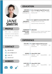
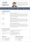
Make a good first impression with your application by using a resume that is not from the last century. This CV template is a bit simpler than others and doesn’t have too many gimmicks. Therefore it is perfect for a professional application. Watch the video to learn how to create a resume template in Word.
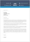
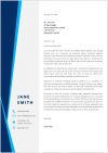
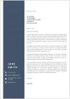
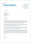
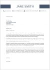
Note: Under the video, you will be able to download the cover letter template.
After watching this video, you will know how to create a resume template in Word. Before we start, please support the channel by hitting the subscribe button and leaving a comment to let me know if you liked the video.
Left Border
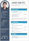
At first, we are going to set the margins to 0. Now we need to draw the rectangular shape. For that we go to “Insert”, then click on “Shapes” and choose the rectangular form. Now you just need to drag the form and place it in the top left corner. And then you can lengthen it to the bottom of the page. Now we will set a width of 1cm for this rectangle and then we are going to set a custom color. Of course, you can choose any other color that you want.
Profile Picture
Now we are going to insert a picture – I am just going to take a picture from the internet, copy it and paste it into Word document. And now we need to change the layout options. And you can also find them in the “Format” tab under the “Wrap Text” button. We can then crop the picture to a circle. And to really make it a circle we need to click on “Crop” and choose an aspect ratio of 1:1. Then we can change the size of the cropping shape and center the picture in it. Then we can drag the picture into the right position and change the size of the picture and afterwards we can already start to insert our first text box with the name.
Name Text-Box
For this text box remove the background color and also the outline color, then drag it under the picture and insert the name. Then we go to the “Home” tab and center the name inside the text box and change the font to 48. Now we drag the box to the right position, change the size of the box and now we can already duplicate it by holding the control key down on our keyboard while dragging it down.
Heading Bar
After we inserted the picture and the name, we can now insert the headings for the resume. I am going to insert a rectangle with two rounded corners. So, I am just going to drag this rectangle again, then rotate it by 90° and now I am going to change the size of the rectangle. I am going to set the height to 6.8cm and the width to 1.3 cm. Then we can also change the radius of the corners by dragging the orange point. And now I am just going to move this bar up a bit. Then I am going to change the color to a grey color. And I am also going to remove the outline of this rectangle.
Let’s now insert a text in this heading space. For that we are going to insert a text box, again remove the fill color and also the outline. Then we can change the text. I am going to set the text to “Profile” here but of course you can choose any other text. I am going to make it bold and also make it a bit bigger. What I’m gonna do now, is to remove the space at the bottom of the text so that the text is vertically centered inside the text box. This is needed to center the text correctly inside the heading bar. Then we can change the text size and now I am going to show you a little trick how to perfectly center the textbox inside the grey heading bar.
So, click on the text box, hold down the “CTRL” key and also click on the grey heading bar. Then go to “Format”, click on “Align” and then on “Align Middle”. And this will center the text box inside the grey heading bar. Now we are going to group the text box and the heading bar, so we can select them together as 1 piece. So, go to “Group” and click on “Group” again. Now we need to position the group, so we position it in a way that it overlaps the blue vertical bar, so that there is no space between the heading bar and the blue vertical bar. A bit later we are going to put the blue bar in the foreground, so this will look perfectly fine.
Content Text-Box
Now let’s insert the text for the profile as we already know it. So, we’re going to create a text box, remove the background color and also the shape outline. Then we are going to put in a sample text in this tutorial. And now I am just going to change the color for this text to a grey color. And I am also going to change the line spacing to 1.5. And now I am going to adjust the position and the size of the text box a little bit so that it fits under this heading bar.
Contact Section
Now we can duplicate the heading bar. So, we first need to click in it and since this is a group with multiple objects, we will see more than one outline here. It is important that we select the outer most outline because this is the outline for the whole group. Then we hold down the “CTRL” key again and drag this outline downwards to duplicate the group. After changing the text we can insert our first contact icon. For that we go to “Insert”, click on “Icon” and then we simply search for the phone icon. And after inserting it, we again need to change the layout options. And we can drag it down to the contact section and change the color. Now let’s change the size of the icon by dragging the corner of the icon or typing in a number directly. I’m going to use 0.7cm. And just position it a little bit again. Then we insert the text box for this icon, so we again insert a text box, remove the background color and the outline color and then position it near the icon. I’m just going to insert 0’s for the phone number and then I’m also going to remove the additional space at the bottom of the text box again. And just position it a little bit and make it a little bit smaller.
To align the text box and the icon correctly, just select both of them, go to “Format” and click on “Align”. And then on “Align Middle” again. To now fine tune the horizontal position of the text box, click on it and move it with the arrows on your keyboard. Then also select the icon and group the text box and the icon again, as we did it earlier. Now I am duplicating the contact information and I am going to exchange the icon. So, I am selecting it, then right-clicking on it, then on “Change Graphic” and then on “From Icon”. And here I am going to type in “mail” to get the mail icon. Then we need to set the correct color again and change the text.
Since the procedure is the same for the following items, the video is speeded up here. Now I am reducing the space between the contact items and afterwards we are going to adjust the alignment for the items. To adjust the alignment, we need to select all the contact items again and to do that there is a nice little function. In the “Home” tab we can click on “Select” and then on “Select Objects” and with this function we can simply drag a rectangle and select all the contact items at once. Now we will make sure that the space between each contact item is the same. So, we go to “Format”, then to “Align” and then click on “Distribute Vertically”. Now we are setting a left alignment for the contact items and then we can start with the next section of the resume, the “Hobbies” section.
Hobbies Section
So, we again duplicate the header bar and change the description and the we insert icons that resemble our hobbies. As always, we need to change the layout options of these icons first. Then we can drag them into the “Hobbies” section, make the smaller and also change the color to the default color of our template. Now we need to set the position and the alignment for the icons again.
Since the left side of the resume is done, it is time to set the alignment for the heading bars. For that, we are again going to select all heading bars, then we go to “Format”, go to “Align” and then choose “Align Left”. And now we are going to move the vertical bar into the foreground. So, we just click on “Bring to Foreground”.
Right Side of the Resume
Then we are going to duplicate the heading bar for the right side of the resume, and we are going to rotate the heading bar by 180°. And now we also have to rotate the text again by 180°, so the orientation of the text box is correct again. Now we just need to align the text box inside the heading bar correctly and make the heading bar a bit longer. We can either drag the heading bar longer, or we can enter a height in cm. And I am going to enter 12.9cm. Afterwards we change the position of the heading bar and we change the text in it.
Now we again insert a text box, then we will remove the background color and also the outline color. And in this text box we type in for example the name of our studies. Then I am going to enter a sample text again and afterwards I am going to remove the space between the name of the studies and this sample text. To make an emphasis on the name of the studies, I am going to make the text bigger. And I am also going to make it bold. And now I am going to position the text box and change the size of the text box. Afterwards we duplicate the text box 2 times and set a left alignment as we did earlier.
Educational Path
Then we insert a line, which is going to resemble our educational path. To make the line perfectly vertical, hold the shift key while dragging it. Now we change the color of the line to a grey color and duplicate the line. For the stages in our education we are going to insert circles and I am going to change the height and the width of the circles to 0.3cm. We then roughly position the circle, duplicate it 2 times and then we select all the circles and 2 lines and set the alignment for the circles and the lines, so that they are centered.
Then we group all the selected objects and now we can duplicate one of the text boxes in which we will insert the name of the school and the location of the school. I am going to set a right alignment for the text, then position the text box roughly and duplicate it 2 times. Now we need to select 2 text boxes that belong together and align them correctly. Depending on which text box you select first, the second one will be aligned to the first one. Now position the first text box horizontally with the arrows on the keyboard, then select all 3 of the text boxes and set a right alignment.
Again, duplicate the heading bar and change the text. And now group all the objects in the education section. And then duplicate the whole group for the experience section. So that’s it. Again, please don’t forget to subscribe and since this is the first video of that kind on my channel, please give me feedback in the comments. I see you in the next video.





Comments are closed.