Want to get a job? Then stand out from the crowd! Learn how to make an eye-catching resume template in Word, so that your job application won’t be overlooked!
With the help of the video, try to create this professional CV yourself. If you do it yourself, you will learn a new skill that your future employer will admire. And of course, you’ll also know how to edit the modern resume template properly. No company wants an employer who cannot even create a resume himself!
So, watch the whole video, create that awesome resume template and rock the job interview. Good luck!
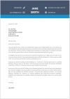
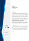
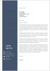
Note: Under the video, you will be able to download the cover letter template.
A modern resume will not only make a good impression on your future employer. It will also show that you have the skills to create amazing documents in Microsoft Word. To get these skills, you should definitely watch the video until the end and try to create the resume template yourself. Before we start, please hit the like button if you think it’s cool that I’m sharing this premium resume design with you for free!
Vertical Bar
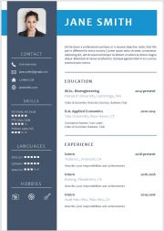
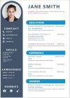
At the beginning, we first have to remove the page margins. So, we go to “Layout”, click on “Margins”, select “Custom Margins…” and enter zeros for all margins. Then we insert the vertical bar. For that we go the “Insert” tab, click on “Shapes” and choose the rectangular shape. Now we simply drag that shape and afterwards we change its size. Since my paper format has a height of 29.7cm, I will enter this exact height and for the width I will enter 6.4 cm. Now let’s change the colors of the bar. So, we first remove the outline color and for the fill color, we will set a custom color. In my case, I will use the color-code R:68, G:84 and 107. Afterwards we have to position the bar correctly. So, we click on “Position” and then on “More Layout Options” – and here we will choose an absolute horizontal position of 0.75cm to the right of the page margin. For the vertical position we simply select a centered alignment. And usually when you are creating documents with a lot of objects like bars, images, text boxes and so on, you should uncheck the option to move the bar along with the text. Because once you would start writing text, every objects in the document would start moving.
Profile Image
Then we will already insert the image. Now, you can see that the image is behind the bar, so we click on “Wrap Text” and then on “In Front of Text”. Since the image has a wide background, I am going to crop it and for that I will choose the rectangular shape. As you can see, the image is still a bit too wide, so let’s change the aspect ratio to 1:1. If we now drag the circles of the image, we can zoom in on the image – inside the cropping shape. When we are done with the cropping and positioning, we apply the changes by clicking on “Crop” once again. As the picture is a bit too big, let’s set a size of 3.7cm. Now we have to center the picture inside the bar. In the first step we will do this roughly with the mouse and afterwards we will do it more precisely by first selecting the bar, holding the CTRL key down and then selecting the image. Now we go to the format tab in the “Picture Tools”, click on “Align” and then on “Align Center”. Like this, the image is now perfectly horizontally centered inside the bar.
Horizontal Bar
At this point we can already insert the second bar. So, we again insert a rectangular shape but this time we will set a height of 3.25cm and a width of 20.15cm. Then we again remove the outline and set a custom color with the color code R:23, G:147, B:207. Now we also position that bar precisely and therefore I will set a horizontal left alignment and a vertical spacing of 1.2cm from the page border. To move the bar behind the other bar, we go to “Wrap Text” and select “Behind Text”.
Name Text Box
In the next step, we can already insert our first text box. Here I will write a sample name, then I will position it roughly and now I’m again removing the outline color and the fill color. Then let’s change the font style to a bold style – set the size 40 – select the font type Candara – and set a white color. To now center the text vertically inside the bar, we first select the bar, hold down the CTRL key, then we select the text box, and afterwards we can choose the middle alignment. Now let’s group these objects together – and again move the whole group to the background. Afterwards we select the image and use the arrows on our keyboard to move it up a bit so that it is right in the crossing point of the 2 bars.
Heading Text Box
Then we again insert a text box – and position it roughly on the vertical bar. Here I will write in the word “CONTACT” and then I’m gonna change the size to 16, set a white color and the Candara Light font type. And as before, I’ll remove the outline and the background color. To center the text over the vertical bar, we first put the text box margins on the margins of the bar and then center the text inside the box. Now we insert the line and to make it perfectly straight, we need to hold down the SHIFT key while dragging the line. Then we change the color to white and the line weight to a quater point. And as we already did it before, we first align the text box and the line – and afterwards we group it. Since there is still a bit too much space between these objects, I’ll move the line up a bit. And to make sure that the group is centered on the vertical bar, we will do the alignment for these objects once again.
Contact Details
Then we insert the next text box for our phone number, – set the right color and font type – and resize it a bit. Afterwards we insert the phone icon. So, we go to insert, click on “Icons”, type in the word “Phone” and select the icon. Since it is in the background, we bring it to the foreground and also change the color. For these icons I usually use a size of 0.7cm. Now we again align the 2 objects vertically, – group them together, – and position it roughly. For the email address, we simply copy the phone number objects group by selecting it and pressing CTRL + C to copy it and then pressing CTRL + V to paste it. Since it will be pasted on top of the other object group, we can simply drag it from there. Then we select the phone icon from inside the second group, right-click on it and choose “Change Graphic” “From Icons”. Here we can now enter the word “mail” and select the new mail icon. And of course, we have to change the color again – and exchange the phone number with the email address. Now I will repeat this step for the other data points. Then we will again align all these contact infos. To select them easily, we go to the “Home” tab, click on “Select” and then on “Select Objects”. Like this we can simpy drag a selection rectangle over the contact infos an all of them will be selected at once. Now we align all of them to the left – and then we also distribute them vertically to get a nice symmetric look.
Skills Section
For the next section I will copy the heading bar and change the text. Then we insert a new text box and remove the outline and fill color – and here I will write in some skills. Of course, we will change the color and the font again. To show the level of the skills, we will insert filled rectangles. So, we go to “Insert”, click on “Symbol” and then on “More Symbols” and here we select the font “Segoe UI Symbol” and the subset “Miscellaneous Technical”. There we can find the filled square. Once we inserted the square, we can copy and paste it 4 times and it is best to always leave a miniumum of one empty space between the squares. Now we duplicate the skills box and write our other skills in there. And if the level of these skills is lower, we can simply select the last square for example and set this black-ish color. That will lead to a nice “hidden” look. Then I’m gonna copy that box one more time – and afterwards we again align all of the correctly. As you can see, the boxes are very far away from each other now, so I’ll move them a bit closer and do the alignment again. And of course, we have to position all the skills nicely under the heading. For the following section I will copy some objects of the “Skills” section and convert the 2 lines into a single line. And as always, don’t forget the correct alignment and positioning.
Hobbies Section
Then we’ll create the hobbies section and for that we will insert 3 icons. For all of these icons, we have to change the layout options again, so that we can move them around. Then we change the size to 1cm – and position them at the bottom of the vertical bar. For the color, we will this time set a white outline color but remove the fill color. Now we align the icons again, – group them, – and position them. And to make the icons a bit more visible, we will also set a biggger line width.
Professional Summary
Now we can start working on the education and experience section. For the summary, we will first insert a text box in the usual way. I will then just paste a sample text and now we will make that box 12.4cm wide and implement the usual text settings. For the color of the summary, we will use the color of the vertical bar. Afterwards we position the box roughly, so that the text is in line with the end of the horizontal bar at the top. Now we insert a line again, – make it 12cm wide, – change the line weight to 3pt. – and the color to R:160, G:175, B:196. To position the bar nicely in the horizontal direction, we can move it over the text, to see if it is aligned well. Then we simply move it down with the arrows.
Education section
Now we insert a new text box for the title. Here we set the size to 16, make the font bold, select the color of the vertical bar and the font type Candara. In the next step, I’ll duplicate that box and write in a sample degree. We now have to make the box a bit larger and insert a tab stop. To insert a tab stop, we click into the ruler and a little “L” shape will appear. When we double-click on that shape, we can set the text alignment at this tab stop to a right alignment. Then we drag it to the end of the ruler – and when we now press the TAB key on our keyboard, we can start writing at the position of that tab stop with a right aligment. Now I’m also gonna insert some other data – and then we can set the font size for all that text to 14. For the name of the institution, we remove the bold font style – and we set the light color, that we’ve set before for the tiny bar above the word “Education”. For the additional infomation we will set a font size of 11 – and then we will insert a space between the institution and the additional text. This can be done by clicking at the end of the line of the institution and then opening the paragraph dialog. Here we can set an after value of 8pt. And of course, we’ll remove the bold formatting from the additional text. Then we can copy that box and insert some other information. After that, I’ll again do a quick alignment – and then group the education section.
Experience Section
Now we can copy that section and also the bar, – align the sections again – and then write in the new details.
Feedback and Support
So guys, that’s it!
Before you go, please keep in mind, that such resume templates usually cost between 10-30$ dollars online and you are getting them completely for free without the need of any registration on my website.
So, it would be great if you could return me the favor and help me grow this channel by hitting the like button on that video. This little gesture will help me a lot!
I wish you good luck for your job interview and hope to see you in the next video 🙂





Thanks for helping me
Hey Shakeel, I’m glad I could help 🙂 Good luck with the application!
Thanks a lot for your help.
What do I do when I finish the first page and want to start a new one. It’s plain and definitely doesn’t match the 1st page.
Hey walaa, thanks for your feedback 🙂 If you wanna make a second page, I would copy the vertical bar on the second page and put some additional small infos in there (e.g. certificates, scholarships, …). On the right side of that bar you can continue as before.